
In order to add a column to a data grid, select a Column Type. Your choice determines what kind of content will appear in the column:
| Column Type | Description | Sample |
|---|---|---|
| Label | A read-only column that simply lists the data from a specified column in your data source table. |
|
| Text Box | Each cell in this column contains a short text box that the end user can type values into. These values can be used to drive calculations and perform actions; for example, if your grid shows a list of products that a customer can add to their virtual shopping basket, the text fields in this column could be used by a customer to specify how many of each item they want to purchase. |

|
| Link Button | Connects to a specified data source column, whose values must be valid URLs. When the grid is rendered, each cell in this column will contain a button that, when clicked, will open the corresponding URL in a pop-up browser window. | |
| Image | Connects to a specified data source column, whose values must be the URL of a valid image or the binary code for an image file. When the grid is rendered, each cell in this column will display the corresponding image. |
|
| Visibility Expression | This is a variation on the Label column type. In addition to specifying a data source column name, you must provide a visibility expression. If the expression evaluates to True, the contents of the data column will appear exactly as they would if you had used a Label. If the expression evaluates to False, the entire column will be hidden. |

|
| Action Link | This column contains no data; instead, each cell in the column houses an interactive button whose label and behaviour are specified by you. A button's behaviour depends on the model Action you allocate to it. |

|
| Check Box | This column presents an interactive check box in each row of the data grid. Similar to action links, these check boxes can be used to trigger an expression. For example, you might want to pass a value from the corresponding grid row into a variable or list when the check box is clicked. This is done using special Grid Expressions. |

|
| Derived | This column allows you to write a custom expression that will execute when the grid loads. In addition to literal values and variable keywords, the expression can refer to the value of other columns, producing results that are dependent on the corresponding value from those columns. The result is displayed as plain text. | |
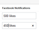
| Mapped Text Box | An interactive version of the Label column type. This column displays the value fetched from the data source but instead of displaying it as plain text, it appears in a text box. The value can then be edited in the same way as a Text Box field. You might use this to fetch a value from the data source, make changes to it and then re-upload it. |

|
| Derived Text Box |
An interactive version of the Derived column type. However, instead of displaying the derived value as plain text, it appears in a text box, allowing you to modify it. As with a Mapped Text Box, you might use this to generate a value or string based on the grid's data, make changes, then upload the new value to the data source. |
|
Grid columns are rendered from top-to-bottom (or, visually, from left-to-right), so Derived columns must appear after any columns whose values they use.