
When configuring a traditional chart definition you have several options for defining its appearance, such as its size, background colour, and border. For example, the following chart has been given a gradient background and black border:

A chart definition with customised visual settings.
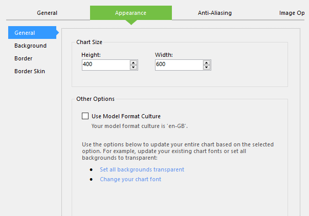
To customise the chart definition's appearance, open the Appearance tab in the Chart Definition interface:
Configuring a chart definition's appearance.
This tab is split into several panels, the first of which is General. This contains the following options:
- Height - The height of the chart definition in pixels.
- Width - The width of the chart definition in pixels.
- Use Model Format Culture - Tick this to use the model's default format culture for the chart.
- Set All Backgrounds Transparent - Click this to set all of the chart's background as transparent.
- Change Your Chart Font - Click this to open a dialog where you can select the chart's default font and text size.
The next panel is Background, which contains the following options:
- Back Colour - The main colour to use for the definition's background.
- Secondary Back Colour - The second colour to use for the chart's background. This is only required if using a gradient style, and you can click Generate to automatically pick a colour that matches the currently selected main background colour.
- Back Gradient Type - The gradient style to apply to the chart background.
Next is the Border panel, which contains the following options:
- Border Width - The width of the border in pixels. Setting this to 0 will remove the border.
- Border Dash - The style to apply to the border. Setting this to Not Set will remove the border.
- Border Colour - The colour to apply to the border.
The final panel is Border Skin, which enables you to choose from a suite of stylised borders for the definition, with additional controls for background colours.