
You can customise the look of a data point in several ways, including customising its colour and transparency, or adding a marker to it. For example, the following shows a line chart where the last data point has been assigned its own colour and a marker.
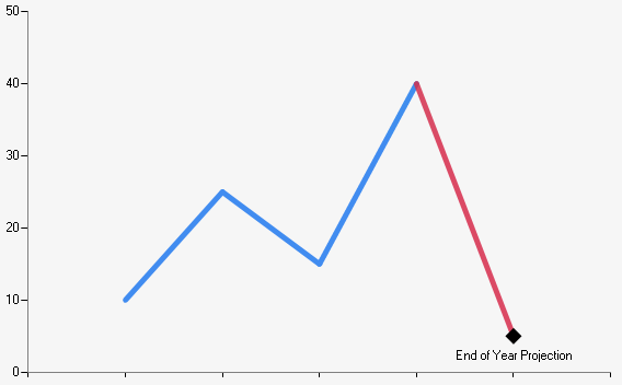
A line chart where the last data point has a custom marker and colour.
To customise a data point's style, open the Appearance panel in the Series Data Point interface:
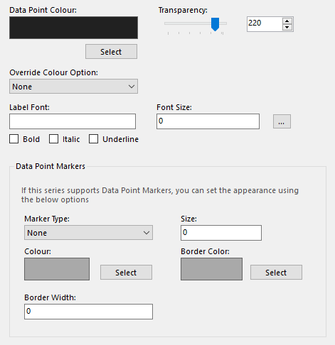
Configuring a data point's appearance.
This panel contains the following options:
- Data Point Colour - The colour to apply to the data point.
- Transparency - The level of transparency to apply to the data point, ranging from 0 (invisible) to 255 (opaque).
- Override Colour Option - Here you can specify how different colour and transparency settings will be applied to the series. If set to Definition, the series will maintain its own colour settings regardless of selections made elsewhere in the chart definition; if set to Transparency Only, the series will maintain its transparency settings in the same way.
- Label Font - The name of the font to use for the label text.
- Font Size - The size of the text in pixels.
- Bold/Italic/Underline - Style to apply to the text.
- Marker Type - The type of marker to use.
- Size - The marker's size in pixels. Settings this to 0 will hide the marker.
- Colour - The colour to apply to the marker.
- Border Color - The colour to apply to the marker's border.
- Border Width - The width of the marker border in pixels.