
You can customise the look of a chart series in several ways, affecting how it will look when rendered in a chart. The following example shows a spline chart where the series have been given a border colour and a gradient effect:
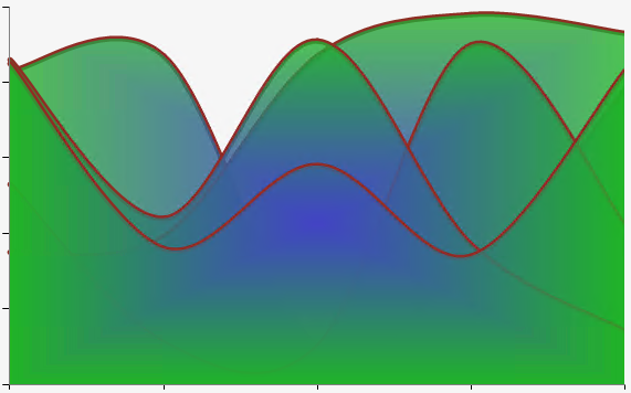
Example of a spline chart with a series border and back colour options, including a gradient.
To customise the title, open the Appearance tab within the Series Definition panel in the Chart Area interface:
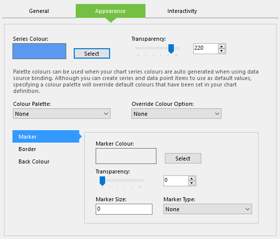
Configuring the visual settings for a chart series.
This tab contains the following options:
- Series Colour - The colour to apply to the series.
- Transparency - The level of transparency to apply to the series, ranging from 0 (invisible) to 255 (opaque).
- Colour Palette - This can be used to select a colour palette that will override all other colour and transparency settings, and assign different colours to all series generated by the data source. If this is applied to a series assigned to a chart area using a static or expression-driven data bind, the palette will be applied to the data points within the series instead.
- Override Colour Option - Here you can specify how different colour and transparency settings will be applied to the series. If set to Definition, the series will maintain its own colour settings regardless of selections made elsewhere in the chart definition; if set to Transparency, the series will maintain its transparency settings in the same way.
The lower half of the tab is split into three sub-panels. The first of these is Marker, which enables you to add a small symbol to each data point in the series. Here you will find the following settings:
- Marker Colour - The colour to apply to the marker.
- Transparency - The level of transparency to apply to the marker, ranging from 0 (invisible) to 255 (opaque).
- Marker Size - The marker's size in pixels. Settings this to 0 will hide the marker.
- Marker Type - The type of marker to use.
Certain types of charts—such as pie charts—are not capable of rendering markers.
The next sub-panel is called Border and contains the following options for adding a border to the series:
- Border Dash - The style to apply to the border. Setting this to Not Set will remove the border.
- Series Border Colour - The colour to apply to the border.
- Border Width - The width of the border in pixels. Setting this to 0 will remove the border.
Finally, the Back Colour sub-panel contains the following options:
- Secondary Colour - The second colour to use for the chart's background together with the specified Series Colour. This is only required if using a gradient style.
- Transparency - The transparency of the gradient effect, ranging from 0 (invisible) to 255 (opaque).
- Back Gradient Style - The gradient style to apply to the series.