
A Traditional Chart is a type of chart definition that can be bound to different types of data, such as data sources, static values, or expression-driven data. They also provide numerous options for customization, enabling you to configure every aspect of the chart, including the chart area, axes, series, markers, and legends.
This makes them ideal for creating more advanced charts and make them suitable for situations where you want to have total control over how the chart appears and the data displayed.
Traditional charts are only compatible with web-based applications and will not render on other platforms, such as mobile projects. To create charts for non-web projects, use a Universal Chart instead.
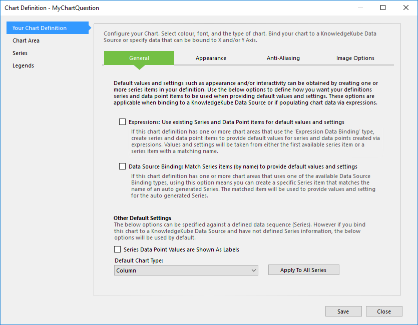
Traditional charts are created and managed using the Chart Definition interface.
Working with charts requires you to deal with several different elements, which can become confusing if you are not familiar with what purpose they serve or how they relate to each other. As such, the following table contains a list of the most important elements of a traditional chart:
| Name | Description | Further Reading |
|---|---|---|
| Chart Definition | This is the actual Chart question, which acts as a central hub for one or more charts, as well as their related settings and data. This is where you define the overall size and appearance, including the options for each chart in the definition. | Chart Definitions |
| Chart Area | A container for a single chart within a definition. Configuring a chart area defines what data it contains and the majority of its visual settings. Every definition contains at least one chart area by default, and each additional chart area will take up an equal amount of space. | Chart Areas |
| Data Bind Type | The type of data contained within a chart, such as values from a data source or generated using chart-specific expressions. | Appendix: Data Bind Types |
| Series | A container for a sequence of data that also defines the type of chart used to present the data. Series are defined independently and can be assigned to a chart, before being provided with data. | Chart Series |
| Axis | A chart area can display up to four axes depending on the type of chart used and the structure of its source data. A typical chart area will render the Y and X-axes - the bottom and left edges respectively - by default. The secondary Y and X-axes - the top and right edges - will only render if the series assigned to the chart area is configured to plot data along those axes. | Chart Area Axes |
| Data Point | A data point is comprised of at least one value each for the Y and X-axes. Data points can be assigned to a series in one of two ways; Static data points are added to the definition directly, and Dynamic data points are provided to the series by an expression or external data source. | Series Data Points |
| Marker | A small symbol that appears over each data point in the series. | Appendix: Chart Marker Types |
| Legend | A visual key that identifies important information in a chart. Series are configured independently and can be assigned to a chart, before being provided with data. | Chart Legends |
| Tooltip | A short message that will appear when the user hovers their mouse cursor over the affected chart element. Tooltips can reference keywords to display dynamic values. | Appendix: Using Keywords in a Chart |
To see how these elements relate to each other in practice, take a look at the following real-life example:
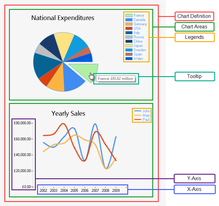
An example of a chart with several elements highlighted.
This chart definition contains two chart areas, a Pie chart and a Spline chart respectively, each of which takes up an equal amount of space in the definition.
Both charts contains many of the same elements but use them in different ways. The following table explains how each chart utilises the different chart elements:
| Pie | Spline | |
|---|---|---|
| Series | Only contains a single series. | Contains three series. |
| X-Axis | Represents each country. | Represents the year. |
| Y-Axis | Represents the national expenditure per country. | Represents the amount of yearly sales. |
| Data Points | Contains 11 data points, which are represented by differently-coloured slices whose size corresponds to their values. | Each series contains 8 data points, which determine the shape of the lines. For example, when the red line—representing the series "Paul"—peaks, this means that the corresponding data point has the X-value "2004" and the Y-value "£80,000". |
| Legends | Each item in the legend represents a data point in the series. | Each item in the legend represents a series. |