
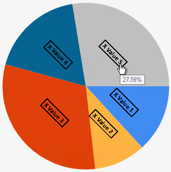
When managing a chart series you can apply a label that can provide additional information. For example, the following pie chart contains series labels that have been rotated 45 degrees and given a border, as well as a tooltip showing the percentage value of each slice:
Configuring the interactivity of a chart series.
To access these settings, open the Series Label panel in the Series Definition interface:
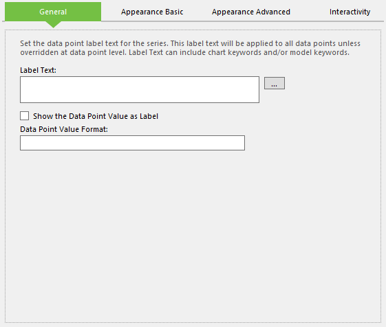
Configuring the label for a chart series.
This panel is made up of several tabs. The first of these is General, which contains the following options:
- Label Text - The text to use as the label. This can include both static text and dynamic keywords values.
- Show the Data Point Value as Label - Tick this to use the value of the data point as the label.
- Data Point Value Format - If using the data point value for the label, this field enables you to provide a standard format string. A complete list of standard numeric formatting options can be found in this MSDN article.
Following this is the Appearance Basic tab, which contains the following options:
- Font - The name of the font to use for the label text.
- Font Size - The size of the text in pixels.
- Bold/Italic/Underline - Style to apply to the text.
- Angle - Defines the orientation angle of the label, which can be between -90 degrees and 90 degrees.
- Label Fore Colour - The colour of the label text.
- Label Back Colour - The colour to use for the label's background.
- Border Width - The width of the border around the label in pixels. Setting this to 0 will remove the border.
- Border Dash - The style to apply to the label border. Setting this to Not Set will remove the border.
- Border Colour - The colour to apply to the border.
Next is the Appearance Advanced tab, which contains several options for applying callouts to data point labels when those labels are too densely concentrated to be clearly visible. When a callout is applied, overlapping labels will be rendered a short distance away with the original position highlighted by a line and symbol.
The following example shows data point label callouts where the label has been placed 30 pixels away, underlined, and an arrow to show the original location:
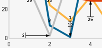
Example of data point labels with callouts.
In order to use callouts, tick the Enable Advanced check box. By default, the Use Default Values option will be selected but unticking this will activate the remaining options in the tab, enabling you to make changes to the callouts.
Finally, the Interactivity tab only contains the option to apply Tooltip text, which will appear when the user hovers over the label. This can also include dynamic keywords values.