
A type of chart that represents supply and demand data as columns of Xs and 0s. The chart is structured according to a formula, meaning a different number of data points may appear in the chart than in the source data, and it does not follow the passage of time.
The X columns—known as a 'rally'—represent data where demand is higher than supply, while 0 columns—known as a 'decline'—represent data where supply is greater than demand. A group of short columns indicate that supply and demand are relatively equal, representing market equilibrium.
If a Point and Figure chart is rendered in 3D, it will not contain Xs and 0s. Instead, the chart will resemble a typical column chart, with rally and decline data represented by alternating colours.
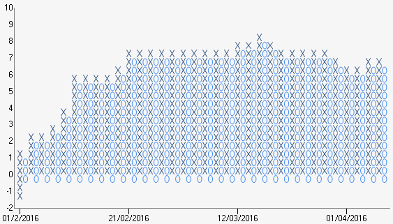
Example of a Point and Figure chart.
| Number of Series | 1 |
| Y-Axis Values Per Data Point |
2, representing: High Price, Low Price |
| Supports Markers | Yes |
| Supports Strip Lines | Yes |
| Incompatible With | All other chart types |