
A type of chart that illustrates four correlating values to show how a data point has changed over time. The line on the left indicates the starting value, while the line on the right shows the value when it closed. The vertical line illustrates the highest and lowest values in between.
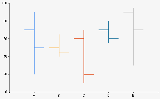
Example of a Stock chart.
| Number of Series | 1 or more |
| Y-Axis Values Per Data Point |
4 or more representing: High, Low, Open, Close |
| Supports Markers | Yes |
| Supports Strip Lines | Yes |
| Incompatible With | Bar, Doughnut, Funnel, Pie, Polar, Pyramid, Radar, Stacked Bar |