
A type of chart that is similar to Box Plot charts, except for the data displayed. In a candlestick chart, the box is used to show the difference between an initial value and a final value. The colour of the box can be used to show whether the initial value is lower or higher than the compared final value.
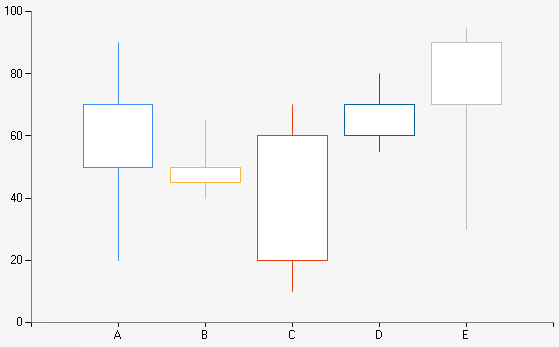
Example of a Candlestick chart.
| Number of Series | 1 or more |
| Y-Axis Values Per Data Point |
4, representing: High, Low, Open, Close |
| Supports Markers | Yes |
| Supports Strip Lines | Yes |
| Incompatible With | Bar, Doughnut, Funnel, Pie, Polar, Pyramid, Radar, Stacked Bar |